Tuesday, September 30, 2014

CARD# HPJ-2014-48: Welcome to the World


Here is a simple nautical-themed baptism card.


The card measures 4.5" x 5.75".

I layered two patterned papers that had distressed edges and added a strip of paper of a slightly different shade from the first layer at the bottom.


I cut out a decorative circle using a Spellbinders die and adhered it onto the card with foam tape. I affixed the metal charm afterwards.

For the sentiment, I handwrote it on a stamped image of a banner I fuzzy cut. I searched online for a type of knot used in boating that I could incorporate into the card and came upon the Carrick Bend. It was simple and easy enough to do and so pretty at that.


I added several blue green crystals and some pearls as a finishing touch. I used two different papers for the inside panels and left them blank for the messages.


A white envelope came with the card. I placed a nautical lining to go with the theme.


Thank you for stopping by. Have a wonderful day!


[Bevania Splendorgel White Board Paper, Carta Bella Sew Lovely, Graphic 45 Secret Garden Collection 8x8 paper pad, All About Scrapbooking Timeless, Eno Greeting Wrapping Paper Book, White Baronial Envelope #6, metal charm, twine, self-adhesive crystals and pearls, Ranger Archival Ink Jet Black, Faber-Castell Multimark 1513 permanent black, Kaisercraft Clear Stamps Bundle of Joy, Spellbinders Nestabilities Splendid Circles]

Wednesday, September 17, 2014

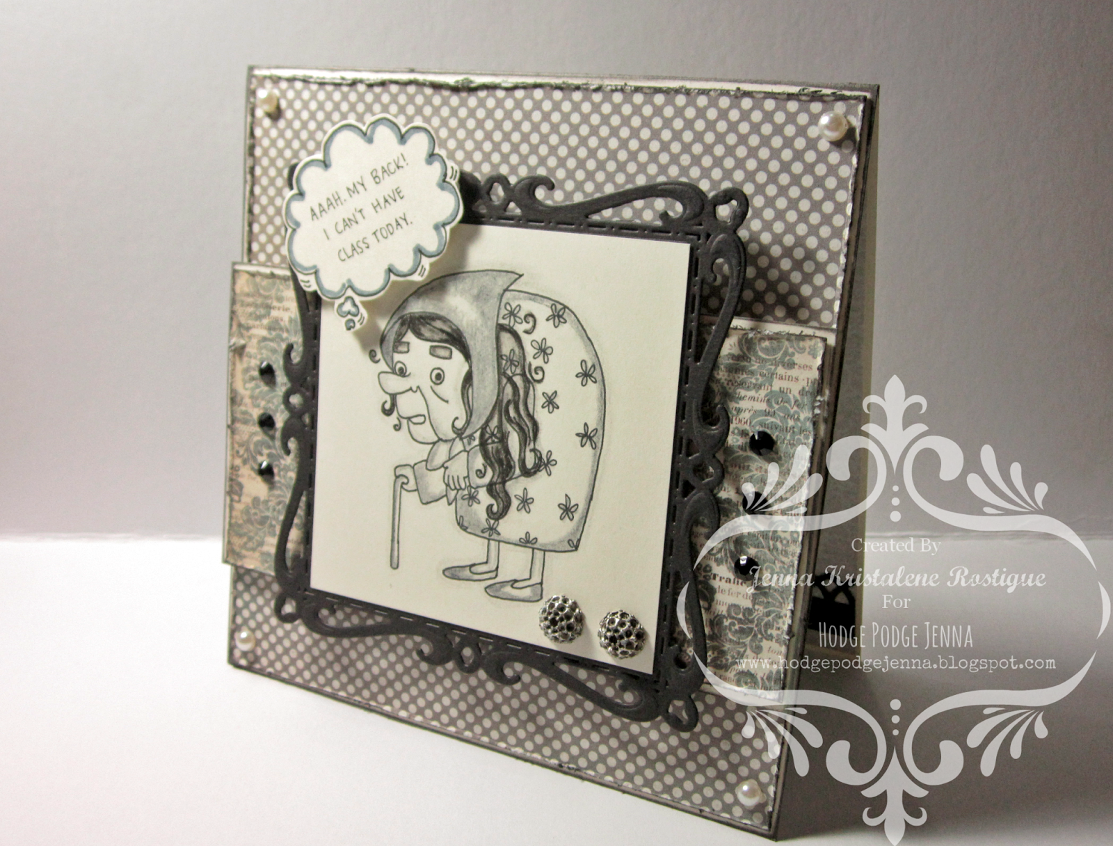
CARD# HPJ-2014-47: Granny

For the lack of a 'creative' title, let's just go with Granny. 


The card measures 5.5" x 5.5".

What was needed for this order was a card with an image depicting a bent woman with a walking stick and a callout (thought bubble) saying,"Aaah. My back! I can't have class today." It was for my housemate's colleague and friend who they tease as a manang. 


My drawing skills suck, but I had to have an image. I found this cute digital stamp online and used it on this card. I forgot about the long curly hair before penning the drawing lines so the image looked a mess. I couldn't do it all over. I just stuck with it.

The edges of the card base and the main patterned paper as well as the second patterned paper were distressed and inked. I should have done the same thing to the image, but I don't know what I was thinking or if I was actually thinking at the time when I glued it down onto the black die cut. Man the focal point looked so clean. It should have been distressed! Gah. I should try to remember to do this next time.


I affixed some crystals and pearls here and there for added effect.


For the inside of the card, since 5 sheets were needed for the messages, I added the upper and lower panels of the card to the count. I only had to insert three sheets of paper through a thin band I made using a border edge punch to complete the five.


I thought I still have some left of a particular wrapping paper I bought from Papemelroti a few years back, but I didn't. I had no other option but to use one of the envelopes I made for Miss Karen's wedding invitation. It was the perfect size for the square card. I placed a piece of round clear vinyl sticker inside the envelope before packing the card to seal the envelope after they finish writing the messages. I no longer added any crystal inside the card so as not to make a certain mark on the paper.

That was that. It was another fun project. Thank you for looking. Have a wonderful day!

MATERIALS AND TOOLS USED: Bevania Splendorgel Ivory Paper (270 gsm and 170 gsm), Rives Tradition Black Board Paper, My Mind''s Eye Portobello Road, Tim Holtz Paper Stash French Industrial Revolution, self-adhesive crystals and pearls, Beauty Quality Pigment Ink Pad Black, Ranger Archival Ink Jet Black, Artline Drawing Pen Black 0.4, Dong-A FineTech Black 0.3, Faber Castell Watercolor Pencils grey and black, Maped Colored Pens Grey, stub, Kaisercraft Clear Stamps Madame Boutique and Botanical Odyssey, Spellbinders Nestabilities Captivating Squares, Cuttlebug Machine V2

Wednesday, September 10, 2014

CARD# HPJ-2014-46: Rock On

I made another Telecaster


The card measures 4.25" x 5.5".


I had to make a music-themed card for an order and came up with this. I was inspired by the layout of this simple and pretty card I found in Pinterest. It was created by Diana Nguyen. You can check out her blog here


I was thinking of not using dimension tape because the card is supposed to be sent abroad meaning it should be light and kind of flat. But then again, it would not feel the same. The look would be different without dimensions. Since the card is already thick due to the additional sheets for the message inside, I thought it wouldn't matter. I've tried sending cards with heavier embellishments to the US before and I didn't have any problems. The lady in the post office only asked me what was inside the envelope because there was an obvious bump. When I told her it was a card, she didn't ask any more questions.

I guess the people here are not that used to handmade cards being sent here and there compared to other countries. I don't think they also know about mail art. I won't discuss it in detail here, but one time I had to put mine inside another envelope, a standard one, to be able to post it. Hmf. I wish people are more aware of papercrafts so they would understand.

Ugh. I have strayed from the topic again. Let's go back to the music-themed card. So I was saying it had to be simple. Not bulky. I used dimension tape for the board paper, but I didn't use any for the telecaster. 

Now about the telecaster... you have gathered that this is not the first time that I used a 'telecaster' on a card from what I said at the start of this post. I actually made one for Telet's birthday three years ago. Hers was red.


The one I made for today's card is slightly different. I didn't draw the details. I punched holes, scored the paper and added tiny pearls instead. I made it neat.


The telecaster was the only embellishment I used. The patterned paper that was peeking out from the slash of ivory board paper acts as an accent. I wrote the sentiment with a fine tech pen.


Inside the card, I affixed a piece of patterned paper (another music sheet). I added a pocket for the extra sheets for the messages. At first I thought of just adding a strip of paper (like a band), but when the customer said she needed 10 sheets, I changed it to a pocket. The stack of paper, though thinner than the board paper I used for the base, would not fit into the band. Thus, the pocket.


I rounded the corners of the cardstock and inked the edges. I stamped several images on the sheets so as not to appear too bare. For the first page, I stamped a banner and handwrote a sentiment. It was a continuation of the sentiment at the front of the card.


I made a lining for the envelope to match the card.


That was that. Another simple card made. I hope to finally start my holiday cards and boxes soon. Thanks for stopping by. Have a wonderful day!


MATERIALS AND TOOLS USED: Bevania Splendorgel 270gsm and 160gsm board paper, Bo Bunny 6x6 paper pad Etc, Rives Tradition Black Board Paper, kraft paper, Tim Holtz Paper Stash French Industrial Revolution, Graphic 45 8x8 paper pad Couture Collection Lovely, pearls, ColorBox Cat's Eye Pigment Ink Antique Pewter, Ranger Archival Ink Jet black Dong-A Fine-TECH Black 0.3, Inkadinkado Clear Stamps Inspirational Lift, Kaisercraft Clear Stamps Bundle of Joy, Bo Bunny Clear Stamps Madame Boutique, Bo Bunny Clear Stamps Flourishes and Such, Fiskars Twist and Flip 2-in-1 Corner Rounder Punch, ticket punch, regular hole puncher, Martha Stewart Scoring Board


Tuesday, September 02, 2014

CARD# HPJ-2014-45: Thank You 2

A simple thank you card.

This measures 4.5" x 5.75".

Since this was to be sent abroad, the card should not be bulky. The design should be simple and clean. The giver wanted summer colors to be incorporated in the design. There should be a butterfly somewhere as well as blueberries.

I thought of using white board paper for this. The whiteness of the base and the minimal embellishment would give the card a striking simplicity.

I adhered a sheet of yellow patterned paper onto the front of the card. I used a die to cut out an image on another piece of white cardstock and then layered it onto the patterned paper. The cutout would now show the yellow paper. It would have looked better if it was adhered onto the base with foam tape, but the additional dimension would make the whole thing bulky. I had to forgo the tape.


For the blueberries, I punched little circles on a scrap of blue patterned paper (from the Kaisercraft Forget-Me-Not Collection) using a regular one-hole puncher. I took the dots out from the small compartment of the puncher and doodled the crowns.


I stamped three small butterflies onto the main card and stamped another set on a separate cardstock. I fussy cut the images, folded them vertically and adhered them onto the stamped images on the card. I affixed a couple of tiny crystals around the butterflies for added effect. And oh I stamped the sentiment as well, but I used black ink instead of the colored ones.


I just placed a sheet of vanilla paper inside and left it blank for the message.


Also, the giver wanted an envelope to go with it. She need not asked. I almost always include an envelope with the ordered card except for the ones that needed boxes.

The envelopes that I have in my stash are store-bought, but I personalize them by adding a lining. I used a piece of paper from one of my wrapping paper books for this particular project.


That was that. It was a simple yet pretty card. I hope to work on another wonderful project soon. Thank you for stopping by. Have a wonderful day!

MATERIALS AND TOOLS USED: Bevania Splendorgel White Board Paper, My Mind's Eye Six By Six Away We Go, Kaisercraft Forget-Me-Not Collection, Biotop Colors Vanilla, ColorBox Cat's Eye Pigment Ink Turquoise, Olive and Pink, Ranger Archival Ink Jet Black, Bo Bunny Clear Stamps You're Invited and Flourishes and Such, crystals, Dong-A Fine Tech 0.2 Black, Spellbinders Shapeabilities D-Lites Sprigs, Cuttlebug Machine V2