Monday, December 29, 2014

Change of Name

Hi there! Welcome to today's post. You might be wondering about the changes I made to the blog recently-- the layout, the contact information, etc. Guess what, I have changed the name of my little venture. From Hodge Podge Jenna, it is now papierush [pa.pje.rʌʃ]. My sister has been pestering me about the name I was using being too common and too long. I had been using Hodge Podge for my tumblog and other accounts so I just basically turned my blogger and IG usernames into the same thing. I would still continue using Hodge Podge Jenna for my tumblr account though, which is my personal blog, and I would be leaving this blog as is. The next posts will be placed on the new blog papierush. I hope you don't get confused.

 I am still in the process of fixing my new blog. Please bear with me for the time being. Thanks and have a wonderful day!

UPDATED TO ADD: When I started this particular blog, I named it Hodge Podge Jenna. I thought hard of a name that I could use for my little venture, but I stuck to it since I have already used Hodge Podge as a username in tumblr and as title in my Facebook banners. I have mentioned the reason behind the name in the previous entry.

Now that the new year has began, I have gone ahead and changed the name of the venture into papierush. I am still using Hodge Podge Jenna though for my personal blog.

When I started accepting paid commissions for cards a few months ago, my sister would always tell me that the name is too long and there are so many Hodge Podges out there. The name has a great meaning to me and I thought then that I could go ahead and use it. But it got me thinking just the same. Since 2015 would be coming in soon, I decided to think of another name to use. Gad. All of the names I could think of that I want are already taken. I pestered my sister to do some brainstorming with me since she wasn’t doing anything much. So, one afternoon, while wearing my energy out thinking of a good name, she suggested Paper Rush. She asked what the French for paper was (papier). “So? What about it? I asked. She said that it is something like sugar rush or adrenaline rush and that it could also be related to papyrus. I got what she wanted to say. In sugar rush, you get hyped up or reach a certain ‘high’ when you consume a lot of sugar. The ‘rush’ in Papier Rush could be likened to the same ‘high’ but with paper. Thus the tagline, ‘A Different Kind of High’. After checking if a domain with the same name already exists and finding none, I decided to use it. We then moved on to how it should be written (or should I say stylized). At my sister’s suggestion, I removed the r from papier  (which makes sense because the r is silent in French) coined the two words and wrote the new one in small caps. We now have papierush pronounced as [pa.pje.rʌʃ]

The next commissioned projects that I would be working on will be posted on my new blog papierush

COMMISSION# 18

Hi there! How are you doing? I hope you had a wonderful Christmas. I wasn't able to go home for the holidays, but I am not alone this year. Hah. My sister was with me and we prepared a little something for Noche Buena. I haven't spent four Christmas Eves at home since I graduated from college. The first two I had to go to work. The third one (which was last year), I was on a bus with my siblings for a 10 to 12-hour ride home. We basically dozed on and off during the whole trip and slept almost the whole Christmas Day. That was just great (note the sarcasm here). And this year, we didn't get tickets again. Tsk. I managed to get my brother a ticket since his planned trip schedule was on the eighteenth. I couldn't go earlier than the twenty-third because I had to attend a friend's wedding out of town. So, my sister and I were left, together with her cat MuShi, alone in our apartment to celebrate the holidays. 

Anyway, I have prattled on again. I am actually here to post the, I believe, last two holiday cards I made for this year. It would take several months before I start off with holiday cards again. So here they are.

HPJ-2014-73: Merry Christmas

I received this commission from a student who happens to be from the same department in the university I attend. My roommates know her. I believe she is a friend of one of my customers and she might have been the one to introduce my Facebook Page to her. Awesome! I met with her to give her the cards the other day. She's such a sweet lady. I might see her more often when the classes start next month.

The color palette for the first one included blue, black, white, ivory, gray. I thought I could use the same materials from a previous project (the holiday frame card). I especially wanted the white poinsettia with glitters and a brad at the center and the papers from the My Mind's Eye Portobello Road 6x6 paper pad. Here is what I came up with.

 The card measures 4.5" x 5.75".


    I inked the card base and the papers and made some layering.


I used a paper doily as a background for the focal point. I then added a die cut. I put a glob of hot glue at the back of the poinsettia for dimension before finally adhering it onto the middle of the die cut. I affixed a couple of gold stamens and small crystals for added effect.


I stamped a sentiment onto a die cut tag and adhered it onto the card with foam tape. I also put together some metal charms and adhered the finished product onto the bow.

MATERIALS AND TOOLS USED: Bevania Splendorgel White Board Paper, My Mind's Eye Lost & Found Two 6x6 paper pad Portobello Road and Breeze, paper doily, lace trimming, metal charms, self-adhesive crystals, stamens, glitters, Elmer's White Glue, All About Scrapbooking brad, Ranger Archival Ink Jet Black, Clear Stamps, Spellbinders Nestabilities A2 Card Creator Tranquil Moments Dies and Splendid Circles, Cuttlebug Machine V2 

HPJ-2014-74: Happy Holidays

I wanted the second card to be green and red. I still have some papers left from my Kaisercraft Pickled Pear Collection enough to make another card.


I used a black matting for the main patterned paper. I distressed the papers and inked them including the card base. I employed layering, but not as much as I did with the other Kaisercraft Holiday cards I made.


I made a wreath out of the red stamens that I have on hand. For the sentiment, I stamped a banner onto a piece of patterned paper and cut the image out. I handwrote the 'Happy Holidays' on it.


MATERIALS AND TOOLS USED: Bevania Splendorgel Ivory Board Paper, Prestige Board Paper Zulu Black, Rives Board Paper Tradition Black, Kaisercraft 12x12 Pickled Pear Collection, My Mind's Eye 12x12 , lace trimming, self-adhesive pearls and crystals, stamens, Ranger Archival Ink Jet Black, Kaisercraft Clear Stamps Bundle of Joy, Spellbinders Nestabilities Captivating Squares Dies, Cuttlebug Machine V2

That was that. Thank you for looking today. Have a great New Year!


Thursday, December 18, 2014

CARD# HPJ-2014-72: Anthony

Hi there! Welcome to today's post. Here is another commission I accepted several days ago. I am glad that people are stumbling upon my Instagram and Facebook Page. Woohoo! I get to meet new people and hopefully I'll become friends with them.

For this particular card, the customer wanted something similar with one of the cards I made before. Remember this?

A former colleague commissioned it for her girlfriend for their first monthsary. You can find the details here

The color palette for the original card included black, white and gold. The new one had to have black, white and red. Here is what I came up with.


The card measures 4 3/4" x 4 3/4" when closed.

The base is white. I used black board paper for the matting and I utilized the papers from the same paper pad that I used before for the older card. The white part is more pronounced in the previous card while black is more prominent in the new one.


For the belly band, I used the same border punch on a black board paper. Instead of adhering a whole strip of patterned paper onto the band base, I cut two pieces to go the front and to the back. This time, the belly band could be removed and replaced by untying and re-tying the lace at the right side of the band unlike the former that needed to be slid upwards.

I actually made a different band at first, but I didn't quite like it. It felt so off that I decided to create another one. I am happy with how it turned out, but to be honest I had a bit of a hard time with it. I mean I couldn't get the metal embellishment to stick to the die cut. I tried hot glue. It would come off. I tried liquid glue next and it would still come off. I then thought of using glue dots. I put about five of them at the back of the embellishment and the thing held on pretty well. I just hope it would stay adhered onto the paper even after the customer gives it to the recipient. [Fingers crossed.]


When you open the card, it would show a white blank die cut in the middle whose border is doted with red crystals. This would be where the message will be written. I stamped a little image at the top.


Since red was a must in the project, I used a red vintage paper from the Graphic 45 Typography Collection. I no longer added pearls nor crystals on the outer flaps. I thought the papers were enough.


I made a matching box for the card. I decorated the sides of the lid as well as the sides of the bottom. I printed the recipient's name on white cardstock and ran it through my Cuttlebug to make a tag. I tied a  length of red baker's twine as a finishing touch. There you have it. Another Napkin Fold Card.

Thank you for looking. Have a wonderful day!

MATERIALS AND TOOLS USED: Orange Poster Paper White, Bevania Splendorgel White Board Paper, Rives Tradition Board Paper Black and Red, Bo Bunny 6x6 paper pad Enchanted Collection, Graphic 45 8x8 paper pad Typography Collection and French Country, All About Scrapbooking 6x6 paper pad It's All About Love, lace trimming, baker's twine, self-adhesive crystals, metal embellishment, Bo Bunny Clear Stamps Botanical Odyssey, Ranger Archival Ink Jet Black, Marth Stewart Border Edge Punch Arch Lattice, Martha Stewart Scoring Board, Spellbinders Nestabilities Fleur De Lis Squares and Labels Thirty-Five, Cuttlebug Machine V2

Tuesday, December 09, 2014

COMMISSION# 16

Hi there! For this particular commission, I had to make three birthday cards. Come take a look.

HPJ-2014-69: Sixty

The first card is for the customer's (a former colleague) mom's sixtieth birthday. She wanted something really special. It is a milestone birthday so I understand what she needed. It has to be something other than the ordinary top fold or side fold card that could be seen in bookstores. When my mom turned 60 two years ago, I had wanted to do something awesome (like maybe make 60 ATCs that have something to do with her), but I didn't have that much time so I ended up just making her four cards.

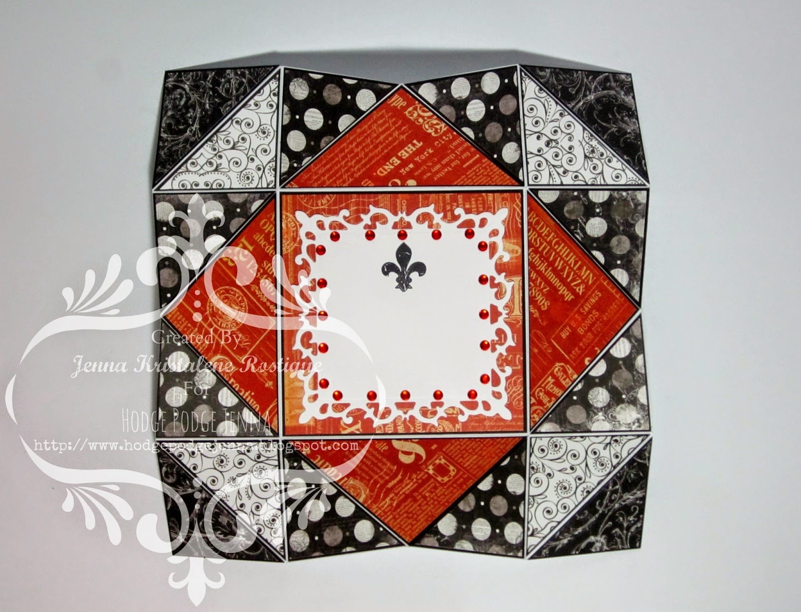
I was informed that her mom likes shoes and bags and I automatically thought of the Graphic 45 paper pad I had from the Couture Collection. I remember seeing a sheet of various shoes and from that I built up the layout and design.


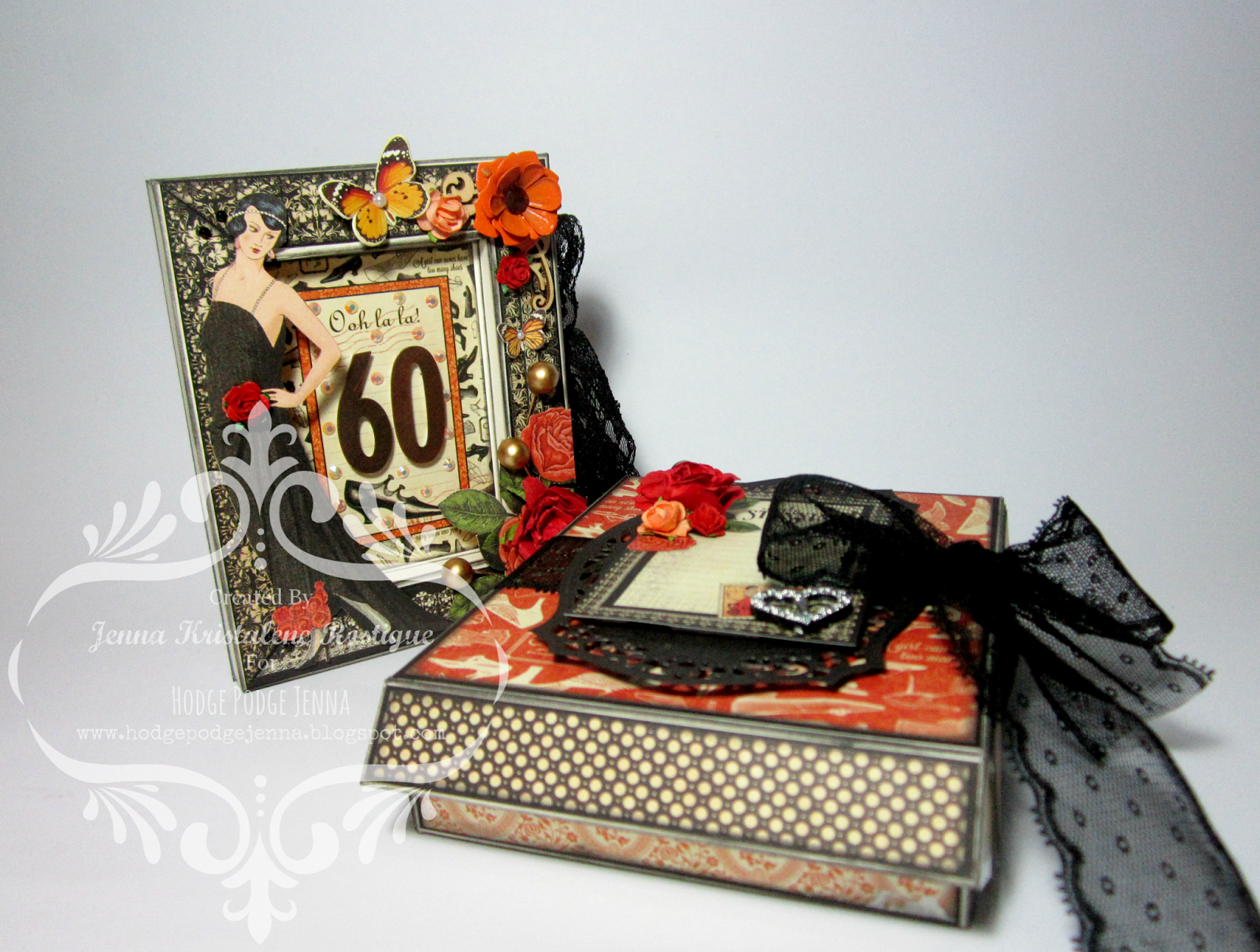
As you may recall, my previous projects involved a popup book card and a frame card. What I did on this particular card was a mash up of the two folding techniques. The front was a recessed frame while the inside was a popup. There had to be extra sheets for the messages (from what I know of my friend, she writes long messages and of course she still has her siblings to write theirs) so I added a pocket at the back that will hold the cardstock.


I love how the front turned out. I fussy cut an image of a lady from the Couture sheet as well as a bunch of roses. I adhered them onto the frame with foam tape. At the center, I placed one of the cards with a shoe on it from the paper collection and added the metallic number 60. I scattered several crystals and affixed a wooden embellishment and a couple of paper flowers. I took some stamens and added them to the frame.


I made the inside simple with only the patterned papers, fussy cut image and self-adhesive crystals. The left panel has a small pocket where they can slip a photo of their mom or a small note. The right panel has a small card which is held by a fussy cut image. They could remove this card and write on it.

I also made a matching box for the card. I didn't adhere the glue tabs since I had to ship them. That is why the white adhesive tape is showing in the photo. I put a length of lace trimming to secure the box together.


MATERIALS AND TOOLS USED: Bevania Splendorgel Ivory Board Paper 270gsm and 170 gsm, Rives Tradition Black Board Paper, Graphic 45 Couture Collection 8x8 paper pad Couture, Fashion, Lovely, Chic, Classy, Fabulous and Elegant , Graphic 45 Typography Collection 8x8 paper pad Inscribe andTypography, die cuts, paper flowers, Eno Greeting wooden embellishment, buckle, lace trimming, stamens, crystals, metal flower, Beauty Premium Pigment Ink Black, Ranger Archival Ink Jet Black, Kaisercraft Clear Stamps Botanical Odyssey and Madame Boutique, Bo Bunny Clear Stamps You're Invited, Spellbinders Nestabilities Adorning Labels Twenty-Five, Cuttlebug Machine V2

HPJ-2014-70: Eighteen

The second card is for her boyfriend's sister. She likes accessories. I still used the Couture papers for this, but I went with blue, green and black for the color palette.

It should be another special card so I used tri shutter for the base. I adjusted the size. It is taller than what I usually make (at 6 3/4").


A tri shutter card has so many panels which means that there are several elements that could be employed to decorate them. For me, more than four designs of patterned paper are needed for the background. Most of the time, it takes longer for me to figure out which papers to use and how they should be arranged before I could actually proceed with the embellishments. The background should be decided first and it should be perfect.


What I love with tri shutter cards is that I could do so many different things on the panels. I could make it a mixed media card incorporating inks, stencils, stamps, molding paste and what not into the panels and making everything coherent to the theme.


The focal point of the front of the card is the image I attached onto a patterned paper and a die cut which was then framed by a wooden embellishment. To accentuate, I added blue crystals onto the frame. It looks simple, but in actuality I had to use more than four techniques to achieve this.


The card was for an eighteenth birthday so I added elements related to it like the sentiment 'Celebrate', the number '18', the die cut 'Moments In Time' and the sticker 'Today Is Extraordinary'.


As for the center of the card, I decided it was to be the space for the message. Again, there should be enough space to write on. I made an accordion 'note' that could fit into the panel and affixed a length of organza ribbon to secure it.

MATERIALS AND TOOLS USED: Bevania Splendorgel White Board Paper, Rives Tradition Black Board Paper, Elit Cream Board Paper, Graphic 45 Couture Collection 8x8 paper pad Gorgeous, Beautiful, Classy, Accessorize, Elegant and Stunning, Graphic 45 Typography Collection 8x8 paper pad Typography , My Mind's Eye Lost & Found Two Blush and Breeze, Kaisercraft Pickled Pear Collection Sticker Sheet, epoxy stickers, clear sticker, button, self-adhesive crystals, Eno Greeting wooden embellishment, Eno Greeting Die Cut sticker, organza ribbon, Ranger Archival Ink Jet Black, Artline Drawing Line 0.4 Black, Golden Molding Paste, Kaisercraft Clear Stamps Bundle of Joy, Grahic 45 Antique Typewriter Wooden Stamp, The Crafter's Workshop Stencil Mini Art Is and Mini Brocade, Spellbinders Nestabilities A2 Card Creator Tranquil Moments, Cuttlebug Machine V2


HPJ-2014-71: Happy Birthday

The last card in the set is for the boyfriend who loves boats. I had difficulty finding a digital stamp or digital image that I could use on what I was thinking to do for this card. After getting frustrated looking through various stuff online, I decided on just making a figure of a boat with paper. Here is what I came up with.

It is a clean and simple shaker card with a crisp white board paper for the base.

 The card measures 4.5" x 5.75".


You know pretty well that I hate my cards flat. I used a lot of foam tape, a length of baker's twine and a metal charm for added dimension.


I decorated the two panels inside the card. The top one has a tag shaped patterned paper for a message or a photo while the bottom one has a band to hold two extra sheets of patterned paper for more messages. That was that for this card. I just made it simple since it was a masculine card.


The card comes with a white baronial envelope lined with a nautical designed wrapping paper.


MATERIALS AND TOOLS USED: Bevania Splendorgel White Board Paper, My Mind's Eye Six By Six Away We Go, My Mind's Eye Lost & Found Two Breeze, All About Scrapbooking It's All About Love, Echo Park 6x6 paper pad This & That, Graphic 45 Typography Collection 8x8 paper pad Typography and Dream, Carta Bella 6x6 paper pad Sew Lovely, Eno Greeting Wrapping Paper Book, baker's twine, self-adhesive crystals, metal charm, sequins, acetate, ColorBox Cat's Eye Queue Pigment Ink Pad Dune, Ranger Archival Ink Jet Black, Ladybug Clear Stamps, Martha Stewart Scoring Board, Martha Stewart Circle Cutter

I enjoyed making even the smallest details of these cards. I hope to create another one soon. Thanks for looking. Have a wonderful day!