Showing posts with label Special Fold Card. Show all posts

Thursday, December 18, 2014

CARD# HPJ-2014-72: Anthony

Hi there! Welcome to today's post. Here is another commission I accepted several days ago. I am glad that people are stumbling upon my Instagram and Facebook Page. Woohoo! I get to meet new people and hopefully I'll become friends with them.

For this particular card, the customer wanted something similar with one of the cards I made before. Remember this?

A former colleague commissioned it for her girlfriend for their first monthsary. You can find the details here

The color palette for the original card included black, white and gold. The new one had to have black, white and red. Here is what I came up with.


The card measures 4 3/4" x 4 3/4" when closed.

The base is white. I used black board paper for the matting and I utilized the papers from the same paper pad that I used before for the older card. The white part is more pronounced in the previous card while black is more prominent in the new one.


For the belly band, I used the same border punch on a black board paper. Instead of adhering a whole strip of patterned paper onto the band base, I cut two pieces to go the front and to the back. This time, the belly band could be removed and replaced by untying and re-tying the lace at the right side of the band unlike the former that needed to be slid upwards.

I actually made a different band at first, but I didn't quite like it. It felt so off that I decided to create another one. I am happy with how it turned out, but to be honest I had a bit of a hard time with it. I mean I couldn't get the metal embellishment to stick to the die cut. I tried hot glue. It would come off. I tried liquid glue next and it would still come off. I then thought of using glue dots. I put about five of them at the back of the embellishment and the thing held on pretty well. I just hope it would stay adhered onto the paper even after the customer gives it to the recipient. [Fingers crossed.]


When you open the card, it would show a white blank die cut in the middle whose border is doted with red crystals. This would be where the message will be written. I stamped a little image at the top.
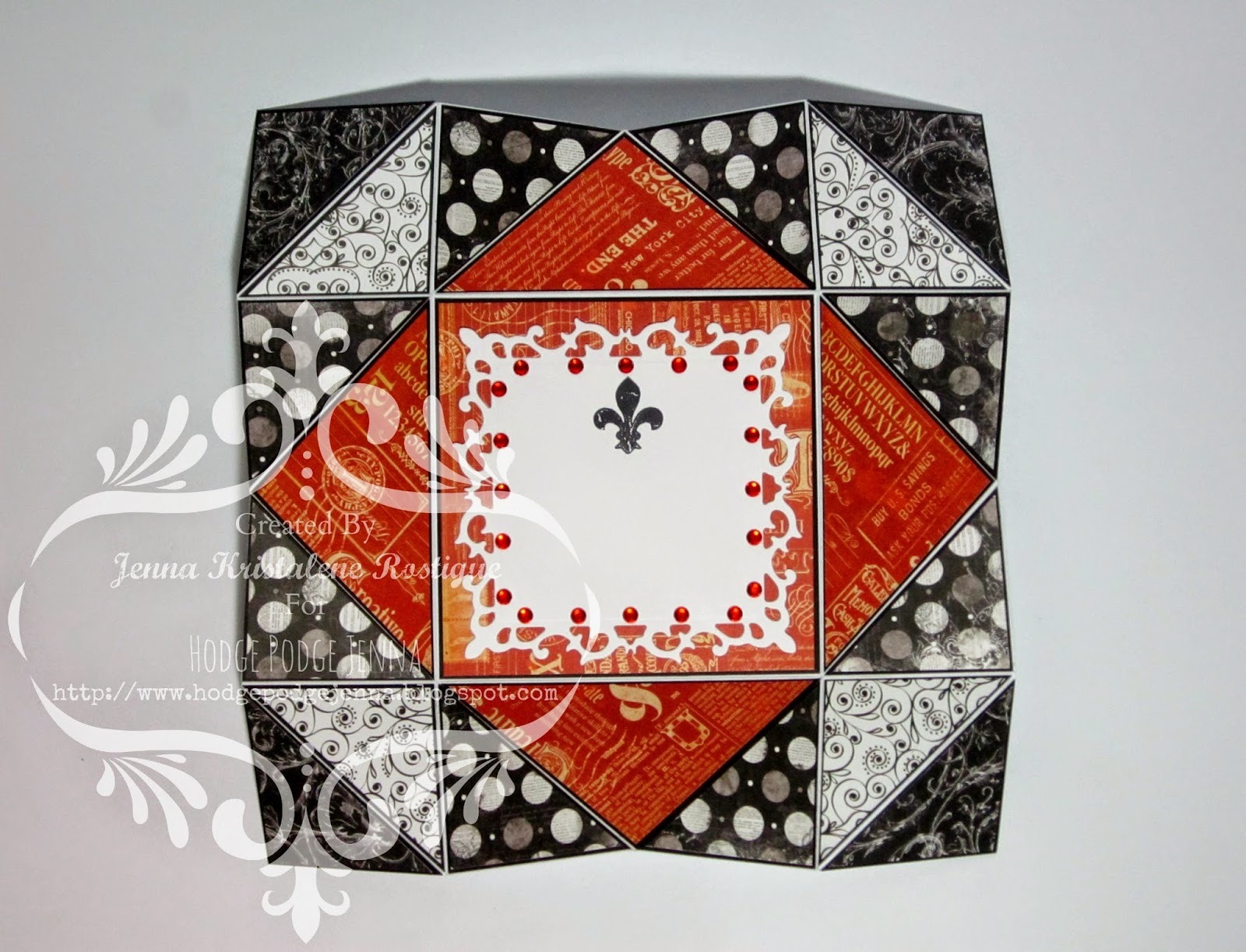

Since red was a must in the project, I used a red vintage paper from the Graphic 45 Typography Collection. I no longer added pearls nor crystals on the outer flaps. I thought the papers were enough.


I made a matching box for the card. I decorated the sides of the lid as well as the sides of the bottom. I printed the recipient's name on white cardstock and ran it through my Cuttlebug to make a tag. I tied a  length of red baker's twine as a finishing touch. There you have it. Another Napkin Fold Card.

Thank you for looking. Have a wonderful day!

MATERIALS AND TOOLS USED: Orange Poster Paper White, Bevania Splendorgel White Board Paper, Rives Tradition Board Paper Black and Red, Bo Bunny 6x6 paper pad Enchanted Collection, Graphic 45 8x8 paper pad Typography Collection and French Country, All About Scrapbooking 6x6 paper pad It's All About Love, lace trimming, baker's twine, self-adhesive crystals, metal embellishment, Bo Bunny Clear Stamps Botanical Odyssey, Ranger Archival Ink Jet Black, Marth Stewart Border Edge Punch Arch Lattice, Martha Stewart Scoring Board, Spellbinders Nestabilities Fleur De Lis Squares and Labels Thirty-Five, Cuttlebug Machine V2

Monday, December 08, 2014

COMMISSION# 15

Hi there! Welcome to today's post. I'm sorry I haven't updated the blog for a while. I got caught up with Christmas preparations that I wanted to take the photos of all the goodies all at the same time.

This particular post is for a friend's custom order. She needed two Christmas/birthday cards. The first one is a frame card. She wanted to showcase the recipient's photo at the front like that of a picture frame. I found a tutorial on how to make one at Malin's blog. I originally thought of making a rectangular one, but I had a hard time with the inner rectangles not matching up. So I just went with the square one. I changed the dimensions though. Instead of a 6" base, I made it a 5.5". I don't want it to be too big. I am still more comfortable with smaller square cards.


I used papers from the 6x6 paper pad of My Mind's Eye Lost & Found Portobello Road Collection for the frame as well as for the inside panel.

I coated the frame with crackle paint.

For the embellishments, I added glitters around the edges of the poinsettia I cut out from a template I found online. If you're interested, you can get it here.
I layered two of each of the three sizes of poinsettia and adhered brads on top. I then placed gold stamens here and there to add more color.

I edited the photo that my friend sent me of the recipient at befunky.com. I used Tintype 1 and chose blue for the hue. I printed the image and adhered it onto the recessed part of the frame card.

I apologize for the low quality photos. I thought I used my digicam to take the photos, but apparently not. I remember I was in a hurry and I couldn't find the camera so I used my tablet. Tsk. I didn't get photos of the inside panels as well as zoomed ones for the embellishments. Hmf.

MATERIALS AND TOOLS USED: Bevania Splendorgel White Board Paper, My Mind's Eye 6x6 paper pad Portobello Road, All About Scrapbooking brads, stamens, glitters, white glue, self-adhesive pearls and crystals, needle and thread, printed image, ColorBox Cat's Eye Queue Pigment Ink Pad Dune, Ranger Distressed Crackle Paint Rock Candy


HPJ-2014-68: Joy

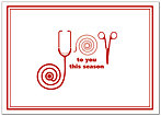
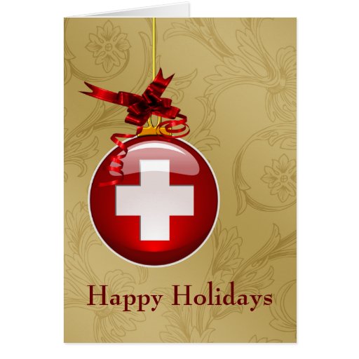
The second card was to be medical-themed since it was for a med student. I looked for inspiration on Pinterest and scanned my craft magazines and decided on making something like these:


The card measures 4.5" x 5.75".

 I incorporated the ideas from the two cards above and came up with this. I drew the 'JOY' part. I haven't drawn for such a long time that the little skill that I may have had from years ago is gone. Tsk. Tsk. Anyhow, I managed to make something similar though not that pretty. Hmn.

I coated a piece of red cardstock cut into a circle with crackle paint and covered a cross with glitters. I added a small bough to complete the ornament. I left the tag at the bottom blank for the giver to write the recipient's name on.


I have decorated both of the inside panels.


I made a small envelope and adhered it on the top panel. Inside it I placed a piece of stamped cardstock for the message. The customer wanted this for the recipient's birthday and requested that a note be written saying that it shouldn't be opened until his birthday. I wrote it on a tag instead of writing it directly on the envelope. There was supposed to be a small puff sticker that would be used to seal it, but unfortunately it slipped while I was packing it. My bad.


Honestly, I don't feel good about this particular card. The front is a bit off. I could have done something better, but I didn't. It is like the front does not match the inside. The elements are not coherent. [sigh]. I guess I have to do much better on the next project. Thank you for still looking.

MATERIALS AND TOOLS USED: Bevania Splendorgel White and Ivory Board Paper, Rives Tradition Board Paper Red, Graphic 45 Couture Collection 8x8 paper pad Lovely and Accessorize, Graphic 45 Typography Collection 8x8 paper pad Create, self-adhesive lace, crystals, baker's twine, string, silk ribbon, glitters, string, Ranger Archival Ink Jet Black, Beauty Premium Pigment Ink Pad Black, Artline Drawing Pen Black 0.4, Crystal Felt Tip Pen Red, Bo Bunny Clear Stamps Botanical Odyssey, Spellbinders Nestabilities Adorning Labels Twenty-Five, Spellbinders Shapeabilities Fancy Framed Tags One, Cuttlebug Machine V2

Sunday, November 16, 2014

CARD# HPJ-2014-65: Magical

I received another custom order, but I couldn't seem to work out a design or a layout in my mind when I first learned about it. The color palette is just white. I struggled a bit on this one.

What was needed was something special for a special someone with an image of a unicorn on it. I was given free reign with regards to the design. I may not have worked out a solid design yet at that time, but I already thought of making a special fold card. Tri-shutter, easel or napkin fold would not do. I looked through my collection of images, but I still couldn't decide on which to use.

The free tutorial from Splitcoaststampers for the weekly newsletter was a big help. It was for a pop up book card. I have seen some projects before using this folding technique and I have wanted to try it for myself. I guess I got too caught up with the other techniques that I only remembered it when I saw the e-mail.

What a great idea! I thought that it would really be something special if I used it. Awesome. Now that the base had been decided, I concentrated on the color palette and the layout next. I will definitely go for mixed media, but without the distressing of paper edges part. It would just be gesso, molding paste, stencils, crackle paint and ink pads. Here is what I came up with.

 The closed card measures 6" x 6". 


If you're interested to make one for yourself or if you would just like to know how the base was made, you can check Norma's step-by-step tutorial here or here. Instructions for an A2 card are also available on the page. There is a video tutorial as well.


The image I used for the front of the card is by Jen. She calls it the Free Winged Unicorn Template. You can find it on her Deviant Art Gallery jenzgu.


The other image (adhered on one of the inside panels) is from a downloadable coloring book.


This is what the leftmost panel looks like up close. I used a stencil and a couple of ink pads to create the delicious little stars and then I made a second batch of stars by applying molding paste onto the stencil.


I added several things more to the inside panels as they looked so bare before with only the stars scattered here and there. I affixed some stickers, crystals and metal charms  to make the whole inside part more interesting.


The card comes with a matching box. I no longer decorated the lid since the card itself is fully embellished. I hope the recipient likes it and that she would have a memorable birthday.

Thank you for stopping by. Have a wonderful day!


MATERIALS AND TOOLS USED: Bevania Splendorgel White Board Paper, All About Scrapbooking 12x12 patterned paper, Dream Street Papers Unique Boutique Antique Chic, lace trimming, Eno Greeting Wood Embellishments, metal charms, crystals, paper flowers, silk flowers, baker's twine, beads, printed images and sentiment, Faber-Castell Watercolor Pencils, Ranger Distressed Crackle Paint Rock Candy, Ranger Stickles, Marie's Gesso, Elmer's White Glue, white glitters, Golden Molding Paste, ColorBox Cat's Eye Queue Pignment Ink Pads Shabby Pink, Celadon, Mint, Orchid, Lilac and Plumberry, Faber-Castell Multimark 1513 permanent Black, The Crafter's Workshop Stencil Mini Punchinella, Spellbinders Nestabilities Splendid Circles and Adorning Labels Twenty-Five, Spellbinders Shapeabilities Fancy Tags One, Cheery Lynn Designs Fanciful Flourish, Cuttlebug Machine V2

Saturday, October 25, 2014

CARD# HPJ-2014-49: Saengil Chukahaeyo

I guess most of the people who stumble upon my posts on Facebook or wherever think that I only make feminine cards which are mostly vintage or something that has a distressed look about them. Well, the majority of my close friends ARE girls and the orders I get are usually FOR girls so that's that. Besides I love using paper flowers and masculine cards are really a challenge.

For this particular commission, I was asked to make a birthday card. It was to be a trishutter card and vintage is a no no. It was to be blue and monster themed. The recipient, as I was told, was fun and adventurous. They wanted it to be similar to the one I made for Ayen a few years back. It was a blue dutchfold card with touches of green here and there. Here is what it looked like:


 The card measures 4" x 5.5" when closed.


I thought of adding other colors to it as well to make the card lively and fun. Of course I did not adhere all the papers down until I received approval to proceed.

This is what the card looks like when it is spread on the table without the embellishments. I had to take care of the background first before putting in the decorations.


This is when the embellishments were added.


Hey there little guy! Heh. It's the little monster on a die cut. I had to affix all the embellishments that needed to go on top of the die cut first before adhering the whole thing onto the front of the card.


This die has become one of my staples in papercrafting. I used the second biggest in the set. I cut out another piece from a white cardstock to strengthen the patterned paper. I made all the parts for the embellishments. The monster is made of felt. I handstitched the outline of the body. I cut out a small triangle for his party hat and adhered a pompom at the tip.

The cupcake is composed of different bits of patterned paper. The balloon is also paper, but instead of drawing a string, I used a length of baker's twine.

I used a shoutout to show the sentiment. It's Happy Birthday in Korean. I wrote the sentiment with my felt pens.


I added two other cute monsters on the inside of the card. They are made of felt as well, but I just drew the details instead of sewing them. I did not put in a pompom because the right side of the card would not be level with the other side when closed. I added another shoutout on one panel.


As I have mentioned in my other posts, trishutter is the one special fold card that my customers are fond of. I don't blame them. Almost any design on a trishutter base looks wonderful. I am still feeling great about this card that I think I would make another trishutter card in a little while for my friend Daidai's birthday. Hmn. I really think I will. Most probably I would be posting the details on my tumblog, but I would also try to post the finished card here. I won't ramble. I promise.

That being said, I say thank you for looking today. Till the next project (commission). Have a wonderful day!

PS I forgot about the Christmas goodies. I have started with the Christmas preparations and I already received an order for 15 pieces from my cousin. I wasn't able to post it earlier. I'll do it once I am done with the other samples. Thanks again!

MATERIALS AND TOOLS USED: Bevania Splendorgel White Board Paper, Graphic 45 8x8 paper Typography Collection, All About Scrapbooking 6x6 paper pad, My Mind's Eye 6x6 paper pad Lost and Found Two Spring Breeze and Six By Six Away We Go, Echo Park This & That 6x6 paper pad, felt, buttons, googly eyes, needle and thread, baker's twine, pompom, Artline Drawing Pen 0.4 Black, Crystal Pens, Dong-A FineTech 0.3 Black, M&G Ballpen Blue, Stanley Glue Gun, Spellbinders Nestabilities Labels Thirty-Five, Cuttlebug Machine V2


Thursday, July 10, 2014

CARD# HPJ-2014-39: A Proper Vintage Gentleman

This is the third commission I did recently. What was needed was a masculine card with cars for the theme and the base would be a tri shutter.


I am starting to believe tri shutter card is the growing favorite of the people who ask for my cards. Though they are a little tedious and exacting to make, they are pretty after all the decorating is finished. So many things can be done on the panels and one can change how the card would be folded to show whichever panels are preferred. This most recent tri shutter card that I made is longer than all the other that I have created. When closed, it measures approximately 6.6" x 4.5". It could still fit inside one of my acetate boxes. Heh.


 I placed a pocket at the back of the main panel to hold the extra sheets for the messages.

I didn't have much left from the set of loose 12" x 12" Graphic 45 papercrafting paper that I bought last month since I already utilized them in my previous vintage masculine cards, but there was enough left for this particular project. The part that was left had the car on it which was perfect. I cut them up and adhered them onto the panels layered with kraft paper and black board paper. Pity the image did not reach up to the topmost panels. There was a few millimeters of black, but I remedied it by cutting a side of the patterned paper and placing the strips on those extra black spaces.


I printed some sentiments and placed them on the inner panels along with one of the images I was asked to include. I was told to add something related to basketball at the top of the photo. The space was a bit small so I thought I'll just add a silhouette and some printed out words. I didn't hear anything after that. I don't know if they have seen the revision, but I did what I could.
The image above is what the card looks like lying flat.


MATERIALS AND TOOLS USED: Ivory, red and black board paper, kraft paper, Graphic 45 A Proper Gentleman Collection, Papemelroti stationery, computerized images and sentiments, pearls, ColorBox Cat's Eye Queue Pigment Ink Chestnut, Caronia Nail Polish Copper Rock Frosted